Design
Fund Texas Choice Webpage
Responsive web redesign for a reproductive rights nonprofit
Overview
In the wake of Roe v. Wade being overturned, my team took on a responsive web redesign for Fund Texas Choice, a nonprofit helping Texans access abortion care through logistical and financial support.
The existing site lacked cohesive structure — critical resources were hard to find, the design felt dated, and the experience didn't reflect the organization's warmth or credibility. Through user research, stakeholder collaboration, and iterative design, we created high-fidelity prototypes that made the site more approachable, informative, and safe.
The Challenge
How might we redesign the FTC website to highlight the need for donations and engagement while establishing easy access to educational and healthcare resources?
FTC was updating their site to address policy changes, build community support, and ensure users felt safe. But the existing site lacked the structure and visual identity to deliver on that promise — its information architecture compromised accessibility to the very resources users needed most.
My Role
As Lead Researcher & UI Designer, I owned the research strategy while contributing to the visual design direction. I led stakeholder outreach, conducted user interviews, and synthesized findings into personas and journey maps that grounded every design decision.
On the design side, I created the project's style guide and designed key components including the events calendar. This dual role meant constantly bridging insight and execution — translating what we heard from users directly into the interfaces we built.
Research
53
Survey Responses
6
User Interviews
2
Stakeholder Interviews
7
Usability Tests
We started with a broad survey on reproductive rights and resource accessibility (53 responses), then conducted six in-depth interviews to understand pain points, motivations, and comfort levels — followed by two stakeholder interviews to align on FTC's goals and gaps.
These insights shaped our persona, Amy, whose journey from discovering FTC to accessing support became the foundation for our user flows and journey maps.
“We deserve to feel like we matter as women. I'm tired of feeling unsafe.”
— User interview participant
Ideation & Synthesis
We mapped Amy's experience end-to-end. The user flow revealed what was missing — and what was overwhelming. We made the deliberate decision to condense the information architecture, ensuring users could find what they needed without feeling lost.
Our storyboard traced Amy's emotional journey from first visit to finding resources, while the journey map highlighted friction points like the absence of an Events page and broken navigation patterns.
Design & Prototyping
Usability testing on the existing site with seven participants confirmed our hypotheses: broken dropdowns, missing events, and a design too bare to leave a lasting impression.
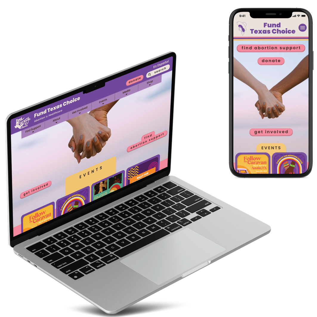
Our team took a divergent approach — half focused on desktop, half on mobile — before converging on a unified design system. Through A/B testing, we aligned on consistent button styles, card patterns, and interaction behaviors across breakpoints.
What We Changed
Restructured information architecture to reduce cognitive overload
Redesigned dropdown navigation for improved usability
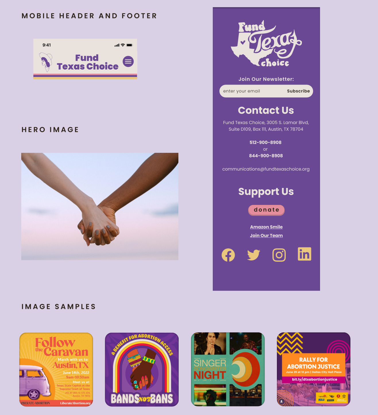
Added a dedicated Events page with interactive slideshow
Created an Impact Report section with educational infographics
Introduced a full-site Spanish translation feature
Designed a policy update banner for transparent communication
Condensed the footer and personalized the staff directory
Built an accessible, unified style guide across desktop and mobile
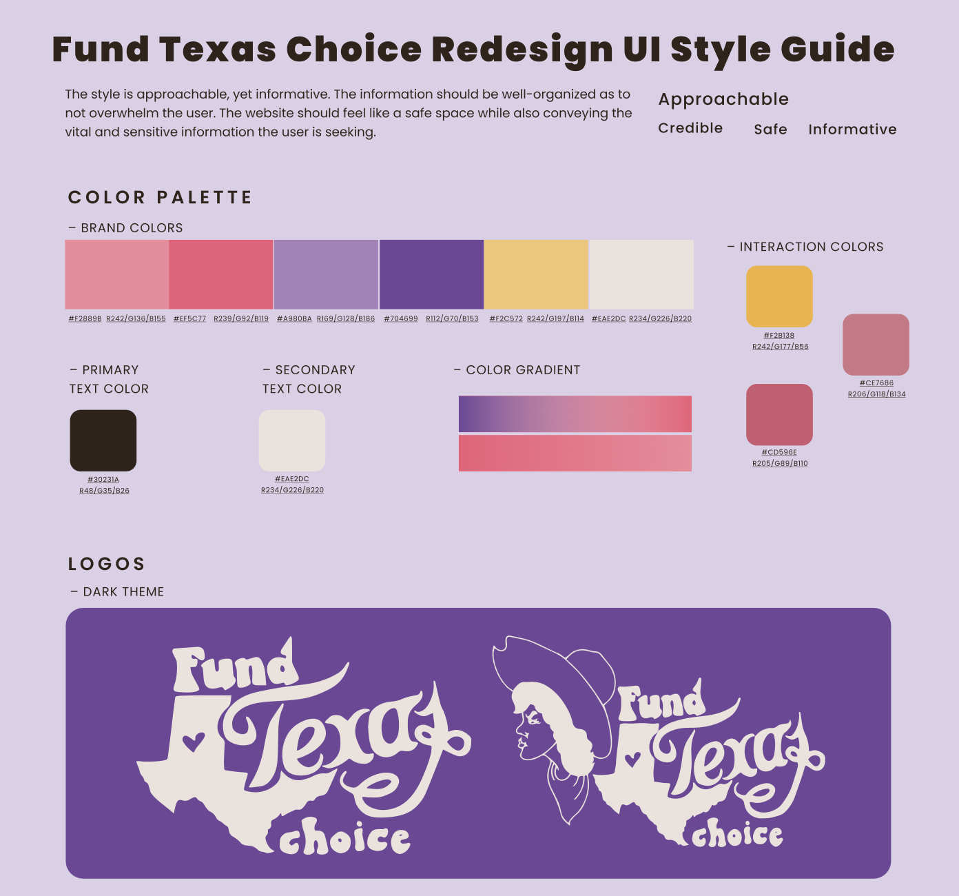
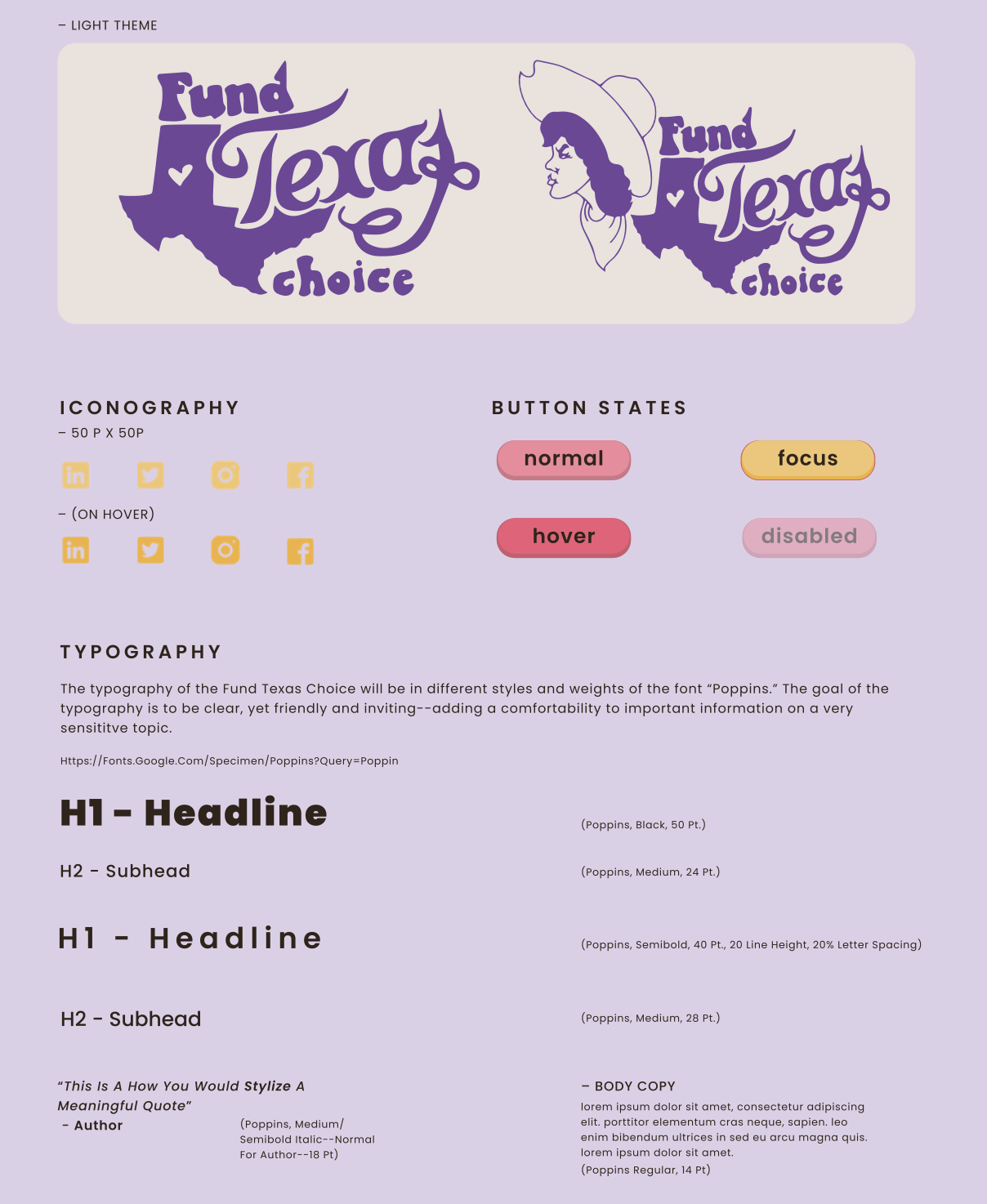
The Style Guide
I led the creation of the style guide that served as the foundation for all design decisions. Every color combination was checked for accessibility and refined through user testing. The result was a visual system that felt warm, credible, and safe.
Outcome & Impact
Our final prototypes balanced warmth with clarity — welcoming without sacrificing credibility. Key CTAs like Find Abortion Support and Get Involved were placed prominently, and every image reinforced FTC's mission of care and community.
Reflections
This project reinforced that the best work happens when research and design aren't separate phases but a continuous conversation. Understanding Amy's fears and hopes shaped every color, word, and interaction.
We learned that responsive design is empathy — meeting users on whatever device they had, in whatever moment they needed support. A strong style guide isn't just about aesthetics; it's about building trust through visual consistency.
If we had more time, we'd explore:
- An interactive timeline of FTC's founding and growth
- A map feature for locating nearby healthcare resources
- An updated shop featuring local pro-choice sellers
FTC's Executive Director praised the intentionality behind our visual and structural choices, and expressed interest in incorporating our designs into a future iteration of their site.